[This is part of a series of posts on visualization of COVID-19 data]
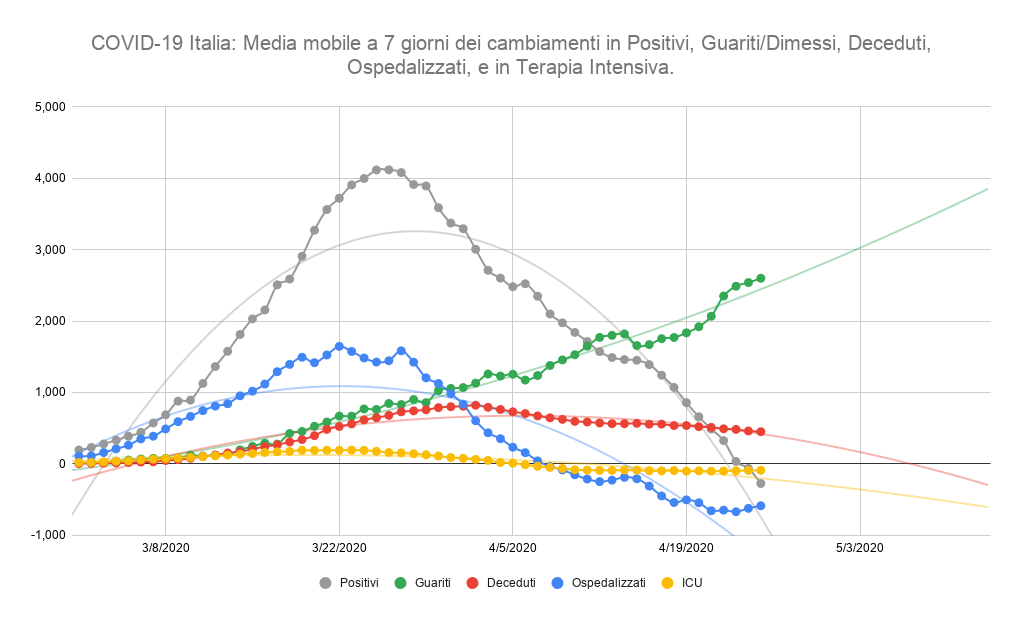
Here is a graph of Italian COVID-19 data showing the 7-day moving average of changes in Positives, Recovered, Deaths, Hospitalized, and in intensive care since March 1st 2020 (Interactive and updated version of the graph below)
The moving average smooths the daily jitters making the trend easier to see. Each data point is the average value for the previous 7 days. The graph was created in Google Sheet.
This graph shows the trend of important measures of the COVID-19 epidemics in Italy. The most reliable data are the daily changes in hospitalized and in intensive care cases. Other figures such as recovered, deaths, and new positives depend on the execution of COVID-19 tests, which in Italy are provided on a limited bases and in same region only for diagnostic purposes of suspected cases of coronavirus, rather than broadly for tracking purposes of the epidemics.