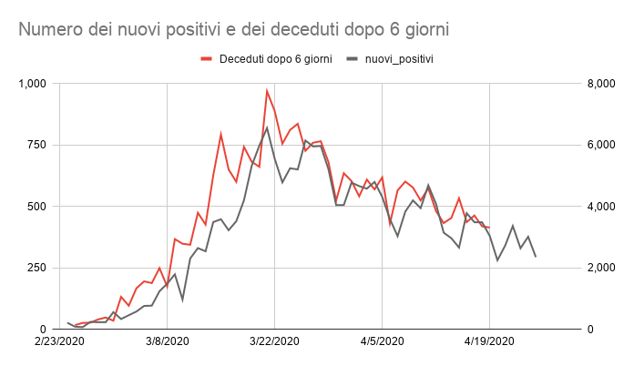
This graph shows the numbers of daily new positive on a given day and the number people who died 6 days later. So for example, on March 22, the graph show the number of new COVID-19 cases reported that day and the number of deaths reported on March 28. The scales for the two sets are not the same: new cases uses the right axis scale and new deaths uses the left axis scale. (Interactive and updated graph below)
The purpose of this graph is to answer the question: when are the number of daily deaths going to decrease? Why are they changing so slowly? It shows that the number of new cases follows a similar pattern as the number of deaths, but with a delay. Using a 6-day (as opposed to 4- or 7-day) delay shows the higher correlation between the two data sets (R2=.869).
Does it mean that there is causal relationships between new cases and deaths? No, this is just a correlation and suggests that there is an underlying variable that influences both deaths and new cases, such as the true number of infections at any given time.
Also, this trend doesn’t mean that patients die after an average of 6 days. Although there are difference in testing strategies in various Italian regions, testing here tends to happen late, when patients start to show more serious symptoms and are hospitalized. (A Lancet article on on early cases in China suggested a median of 18.8 days from contagion to death).
And here the same graph with US data and I found a similar correlation. In fact, the fit seems too good to be true…. But I checked and rechecked and these are indeed new cases vs deaths after 6 days. With US data too, the highest correlation between new cases and deaths is with a delay of 6 days. This curve is still on the rise, although flattening in the course of the past 3 weeks.
I suspect that the “local” up and downs are weekly changes due to difference in data reporting or testing, if you notice, they have an almost weekly rhythm, with lower points after the weekend. The overall trend should be more reliable.
In general, I found the US data messier and more variable, probably due to the fact that are collected at the State and County level, with less centralization in the data collection. For example, I found two sources of daily deaths, with a progressively larger gap between the two dataset. Here I used the more conservative, although the general trend results of the other dataset is similar.