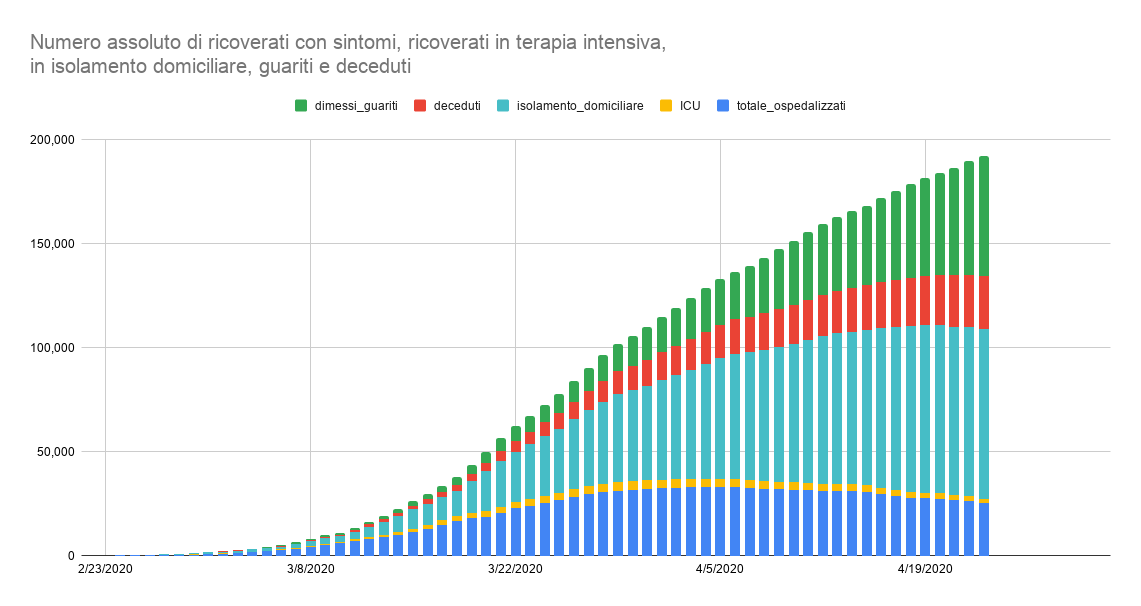
Italian COVID-19 data showing the number of recovered (green), deceased (red), in house quarantine (teal), intensive care (yellow) and hospitalized with symptoms (blue) day by day. (Interactive and updated version of the graph below)
I like this graph because it summarizes all the data of epidemics evolution in Italy in a single visual representation.
The shape of the curve up to the teal bar shows the “currently positive”; this is the part that will trend down as R0 goes down and new cases decrease. The shape at the top of the curve shows all the people who tested positive for coronavirus since the beginning of the epidemics; this part will flatten as the infections slow down.
As usual, remember that this data only reflect those that have been tested for COVID-19. The actual number of infected and deaths due to the virus is higher but unknown.
—-
Dati COVID-19 in Italia che mostrano i numeri dei guariti (verde), deceduti (rosso), in isolamento domiciliare (turchese), in terapia intensiva (giallo) e in ospedale (blu) giorno per giorno.
Questa visualizzazione mi piace perché contiene tutti i dati dell’epidemia nello stesso diagramma.
La forma della curva fino alle barre turchesi indica gli “attualmente positivi”; questa è la parte della curva che diminuisce quando l’indice di infezione (R0) diminuisce.
La forma della curva complessiva indica il numero di tutte le persone che sono risultate positive al coronavirus. Quest parte di schiaccia e diventa orizzontale quando le infezioni diminuiscono.
Come al solito, ricordatevi che questi dati riflettono solo i numero di coloro che hanno ricevuto il tampone per COVID-19. Il vero numero di coloro che sono stati infettati e le morti dovute al coronavirus sono di più.